Master Sales Analysis with Excel: A Step-by-Step Guide to Data Summarization
In this section, we’ll continue working with the sales data by using Excel’s pivot tables and charts to summarize key insights. First, we want to look into how different products are performing across the week and uncover any patterns in customer buying behavior.
Accessing the Pivot Table
To create a pivot table in Excel, follow these steps:
- Open your sales data in Excel.
- Select the entire data range you want to analyze.
- Navigate to the Insert tab on the ribbon.
- Click on PivotTable.
- Choose where you want the PivotTable to be placed (new worksheet is recommended).
- Click OK.
Generating Initial Insights
Now that you have your pivot table set up, let’s generate some initial insights:
- Drag relevant fields into the Rows and Values areas to summarize data (e.g., Sales Date in Rows and Sales Amount in Values).
- Analyze the data displayed in the pivot table for any immediate trends, such as total sales per month or category.
- Make any necessary adjustments to fields to better understand your sales patterns.
Focusing on Specific Products
Once we have a general overview, we can filter our dataset to concentrate on specific products that are significant to our analysis. For this post, we’ll narrow our focus down to moisturizers and conditioners, as they are two key products in our portfolio.
Analyzing Sales by Day of the Week
Let’s now drill down further by filtering down to these products and looking at the sales trends by day of the week. Specifically, we’ll focus on the following steps:
Step-by-Step Guide to Summarizing Moisturizer Sales
- Filter the products: In your pivot table, add the products field and filter it to show only moisturizers. You can do this by dragging the products field to the filters section.
- Add sales date: Next, let’s drag the Sales date into the Rows section. This will break down sales day by day, allowing us to see trends more clearly.
- Insert a line chart: At this point, you can insert a simple line chart to visualize the sales trends over time.
- Switch to a double histogram: Initially, we might not see any obvious trends, so let’s change our chart to a double histogram. To differentiate between different product types, drag the product_name field into the legend section.
Insights from the Chart
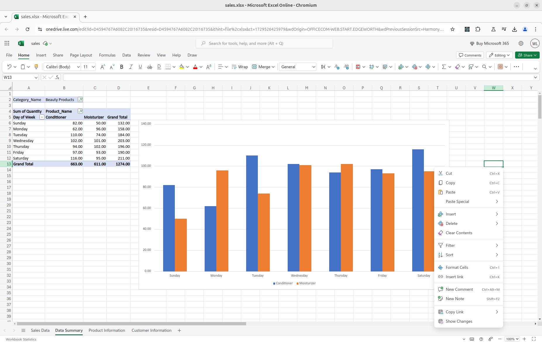
Now, let's take a peek at the daily, weekday, and weekend shares of moisturizer to get a sense of any patterns in buying trends. Did one of our campaigns push more people to buy these products? Do we see more purchases on weekdays or weekends?
Interestingly, Sunday shows notably low sales for both moisturizers and conditioners, especially for moisturizers. But Monday seems to be a major day for moisturizer sales. Everything else tends to level out midweek, with no dramatic peaks or drops for these two products.
Now that we’ve summarized the data and looked into a couple of our products, stay tuned for next week’s post, where we’ll add customer information to help build a marketing campaign around increasing sales in this category.